08 Sep Why You Should Decorate with Taupe
Why You Should Decorate with Taupe
Why is this color relevant today?
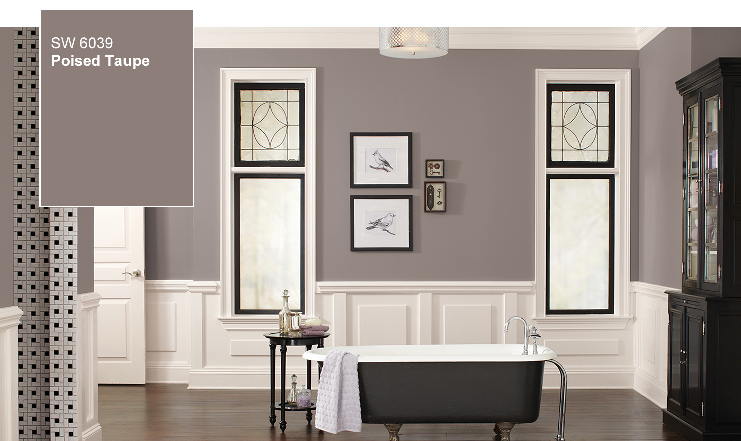
The 2017 Sherwin-Williams Color of the Year, Poised Taupe, is available in SW 6039. Photo: Sherwin-Williams
Sherwin-Williams recently announced its Color of the Year for 2017: Poised Taupe. Susan Wadden, top color picker, describes this color as, “what happens when cool gray gets together with brown and has a baby.”
What exactly is taupe? Taupe can be defined as “a moderate to dark brownish gray, sometimes slightly tinged with purple, yellow, or green.” The word taupe, meaning mole, originated in France in the early 1900’s.
How do they choose the color of the year? In an article from Custom Home, Kayla Devon notes:
“At Sherwin Williams, six team members substantiates their color picks from a concentrated industry and presents a color story to all other team members expressing what the story says about cultural sentiment. From there, four final color stories are determined, which Jordan says is significant because there are different tastes and different things happening simultaneously. When it comes to choosing the color of the year, Jordan takes over, searching for the story with the strongest message and the color that communicates the larger picture.”
After choosing the Sherwin-Williams Color of the Year for 2016, Alabaster, Jackie Jordan stepped down; which gave room to Sue Wadden to enter the role as top color picker. Although we cannot be sure that the the current top color picker for Sherwin Williams, Jackie Jordan, uses this process as well; there is no argument that choosing the Color of the Year doesn’t happen by accident.
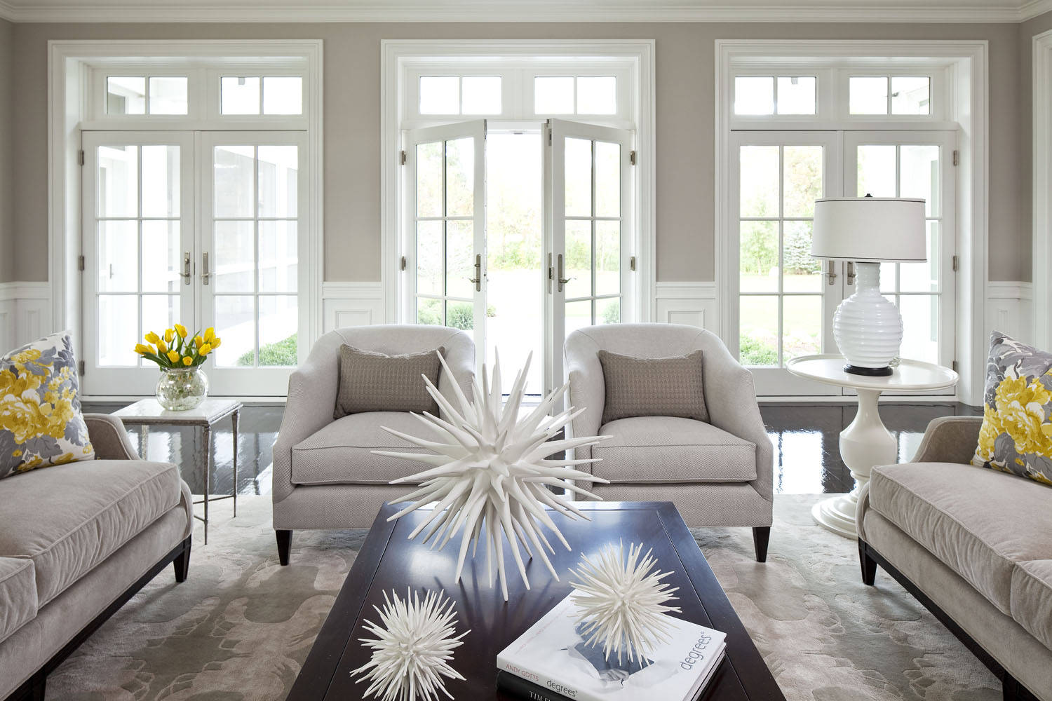
Poised Taupe is a dynamic color that accents well with neutrals and vibrant colors. Photo: HomeDit
Why is this color applicable now? After years of seeing gray dominate the home design scene, it is about time that a warmer color would come into play. The gray-brown color adds a level of sophistication and warmth to any home and can be seen in many home decor companies.
Poised Taupe proves to be a dynamic, yet muted color. It has more personality than a typical beige or gray; yet it can coexist with neutrals and vibrant colors alike. We believe that this is the perfect color for those wanting to add some warmth to the overwhelming amount of gray that appeared in home design this year. According to the Huffington Post, Poised Taupe is “not hot or cold, gray or brown, dark or light, taupe exists somewhere in the lukewarm middle zone.”
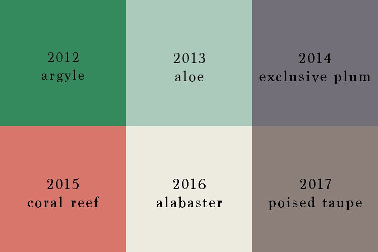
Sherwin Williams colors of the year from 2012-2017
There are a variety of hues from the Color of the Year picks from 2012-2017. From 2012-2014, cool colors dominated the scene. Then in 2015, Sherwin-Williams picked the vibrant pink-orange color: Coral Reef. Coral Reef was chosen for 2015 because it was, “perfectly suited to celebrate a mid-decade year that’s poised for revitalization.” This can be seen as the turning point for Sherwin-Williams Colors of the Year to follow.
The next year, the paint company chose Alabaster for the 2016 color. Alabaster represents the “less is more” mentality-perhaps stemming from the rise in minimalism. From there, another neutral color was picked: Poised Taupe. With Alabaster in 2016 and Poised Taupe in 2017, we can only guess what is on the rise for 2018. Do you think that neutral colors or here to stay, or will we go back to vibrant colors such as Argyle and Coral Reef? Who knows, maybe the bright and vibrant colors of the past will come full circle.
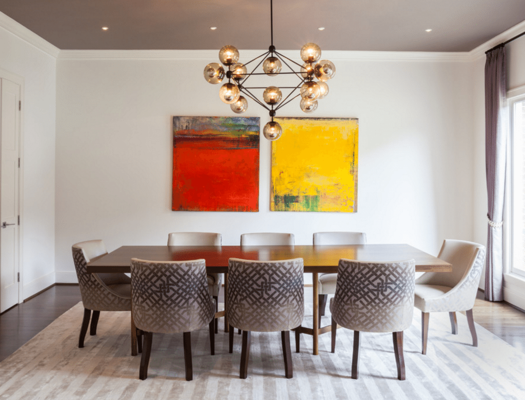
The Poised Taupe painted ceiling adds an element of coziness to the tall ceilings in this dining room. Photo: Dump McConnell
Not sure how to use the Sherwin Williams’ 2017 Color of the Year in your home? Check out their website. The popular paint company has put together several color palettes that best accent their Poised Taupe.
Sorry, the comment form is closed at this time.